
Vantage Apparel is a B2B and B2C clothing wholesaler with an emphasis on their decoration capabilities. Vantage was looking to totally refresh their current website and make their site friendlier with a more B2C feel. The client filled out a brief based on questions provided to them. I was provided with SEO and persona research as a starting point for this project.
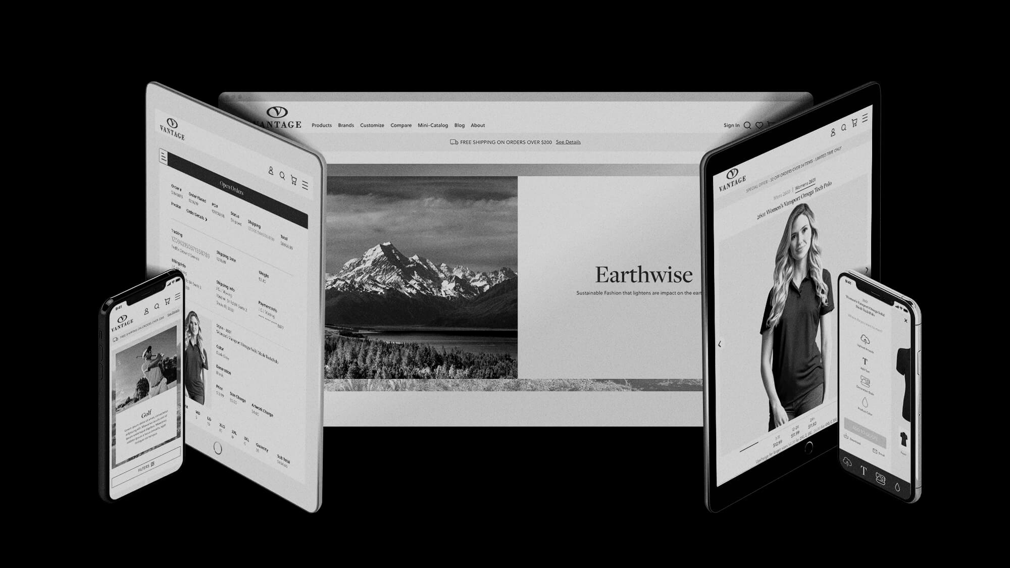
Take the client brief, SEO research, personna research and then do my own research into their competitors’ styles, looks and capabilities, then deliver a high fidelity prototype to be used to create a responsive website. The prototype needed to include desktop, tablet and phone sizes.
update entire look and feel
create a better, more robust experience for the myVantage portal
make it easier for customers to reach out to Vantage in various areas of the website.
create a better user flow for adding decorations and accessing info on the site
follow the usabilty testing and course correct
allow for more marketing areas on the website
enhance the user experience for the various tools already available on the site
create a working prototype for review and dev
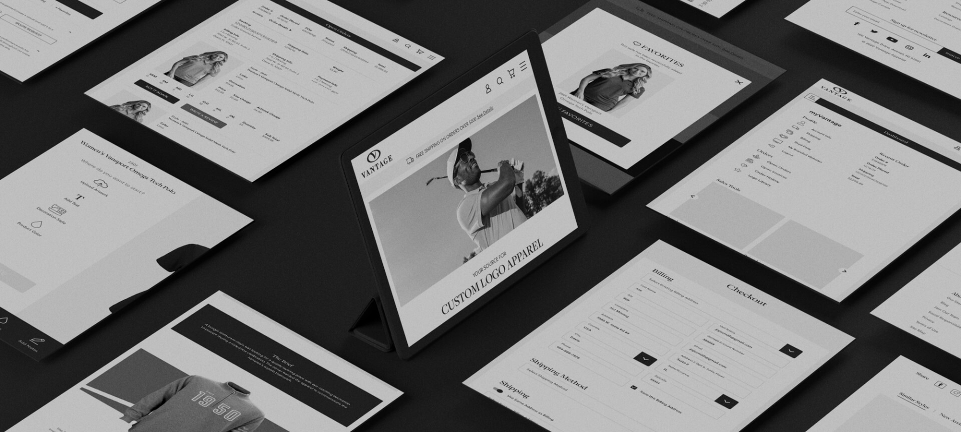
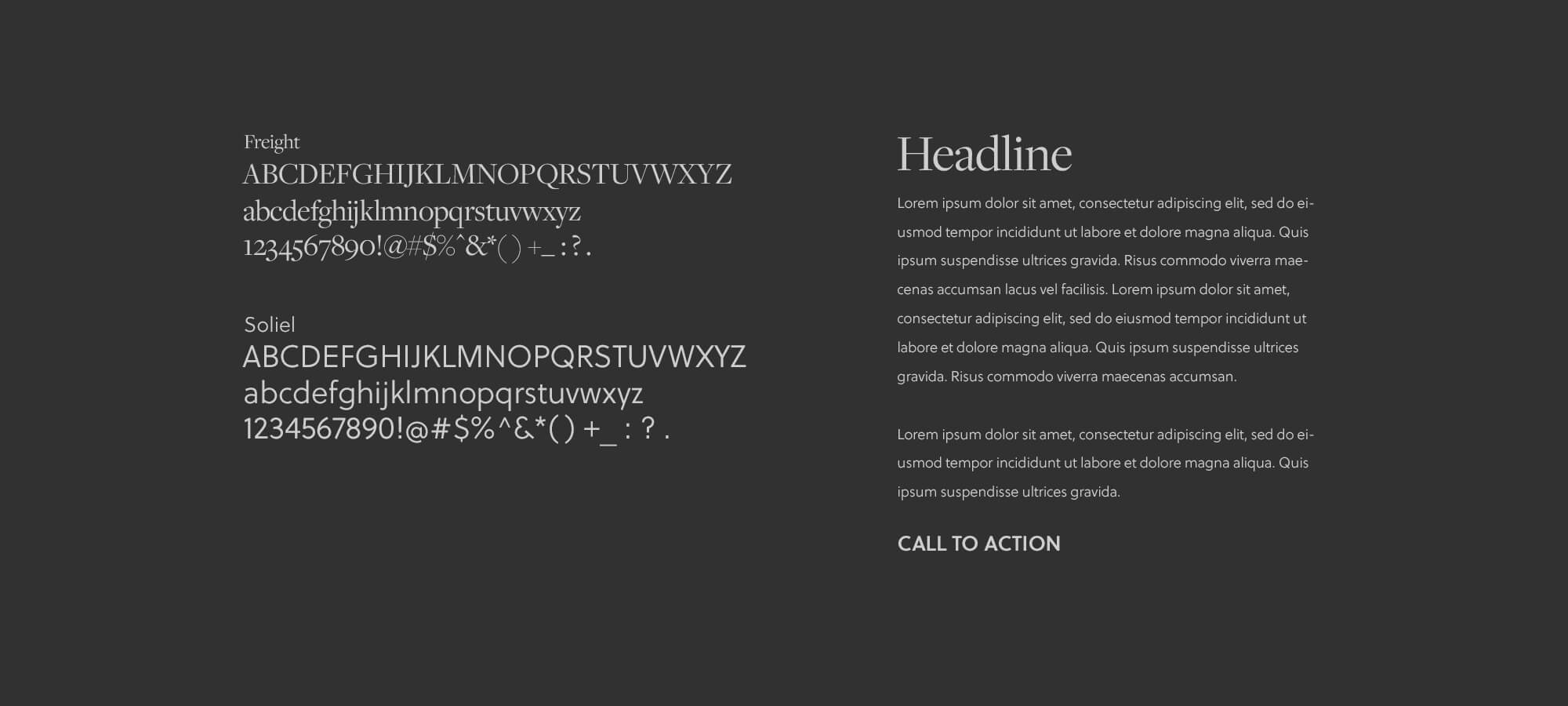
Vantage’s current site was looking a bit dated and their brand guides were very minimal, mainly consisting of the logo. So I decided to update the fonts and give them a serif for headlines and large text and a new sans serif font for body copy and smaller headlines. I used the navy blue logo color as my main color choice and kept it monochromatic with a lighter blue for links and callouts.
I increased the image sizes and white space on all the pages to give the brand a more contemporary feel. I played with staggering the page balance giving it a more 60 / 40 alternating look and having large color block areas separating content, so on longer pages the eye doesn’t get tired from too much repetition.
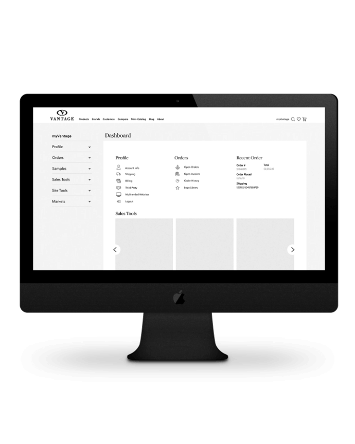
The current portal was outdated and lacking in customer engagement. To increase user ability, I set up a dashboard for returning users to easily find important info, like shipping and past orders, and allowed for customers to buy again. For the sales team, the portal includes an easy area for them to access all the important tools and data information, like data and sales sheets, and catalogs.
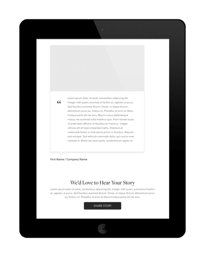
To make it easy for customers to reach out to Vantage, I placed call to action contacts at the end of all the information pages. This way, if they were interested in something, they could immediately get in touch with someone for help. I also included a testimonials area where customers could write in to tell everyone about their experience with Vantage. An instagram feed was added to the homepage and a easy email form was added to the footer.
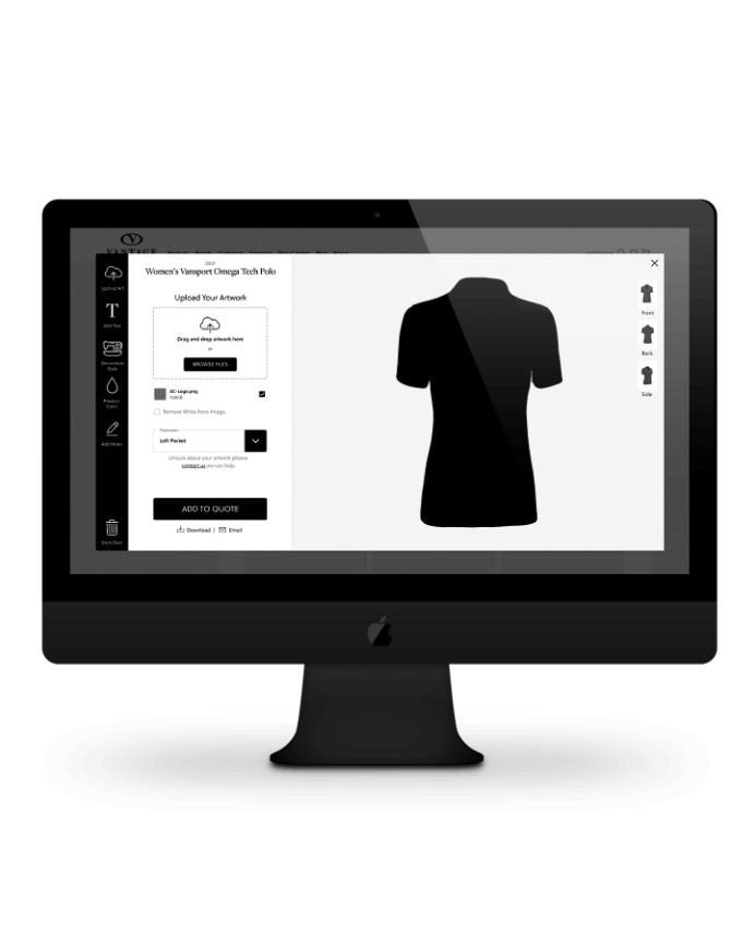
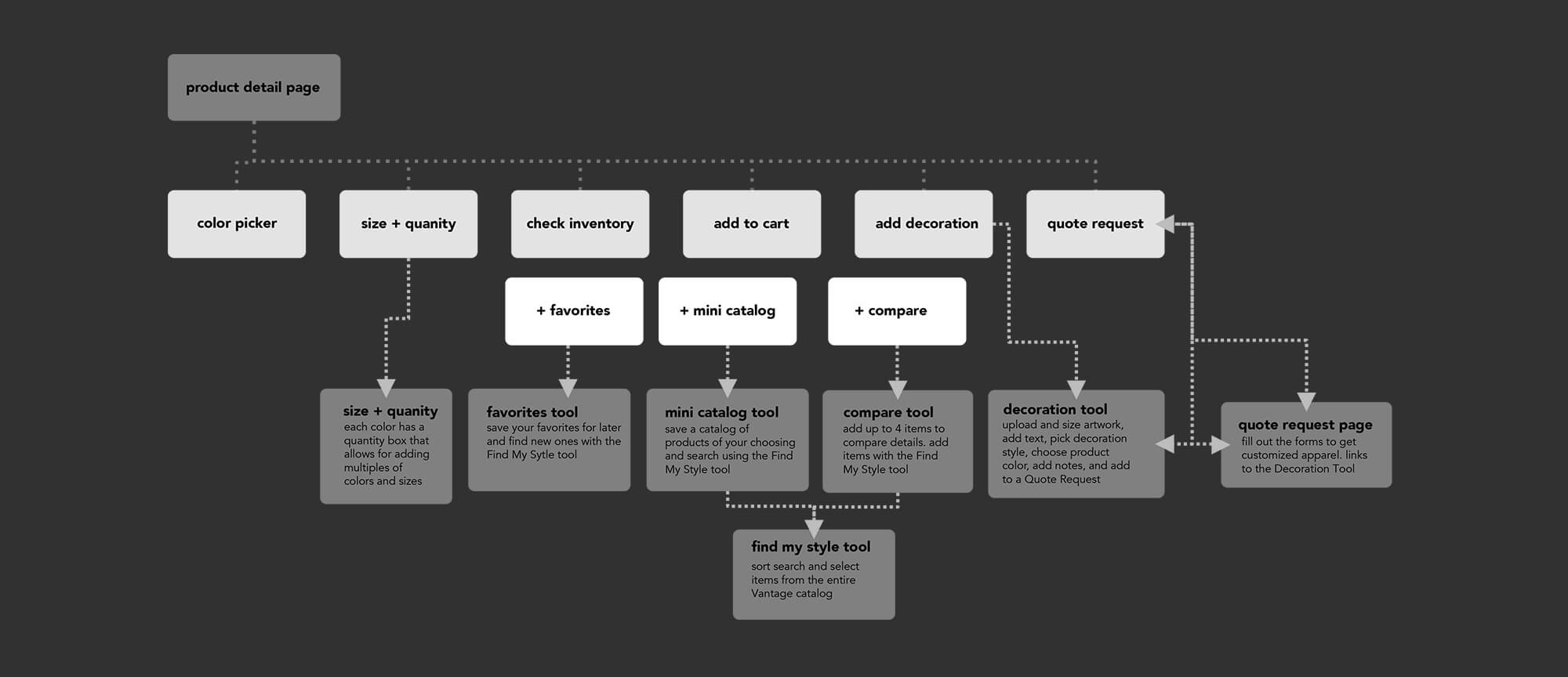
The biggest user flow problem was the ability to add decoration elements to a garment. Currently, the experience was at best difficult to understand. The user would have to find the Create Virtual link buried underneath the product photo next to 7 other links. Once they clicked that link, it would open up a rudimentary virtual logo and text placement tool where they would have to find the garment again in a huge drop down list by name. Once they did that, they needed to save their choices and a form field would appear at the bottom of the page where they could send the virtual to an email address, then add it to a quote request. That was tiring just typing!
To make the process easier, I made a clear, distinct Decoration area on the right hand side of the product page where all the information about the product would be housed. When the user clicks the add decoration button, a new Virtual tool would be waiting. The tool would already have the user’s garment chosen when opened, and there they could easily add all the customization options needed. And at the bottom there was a very clear button to add the creation to a quote request right from the tool.
Usability testing was conducted prior to the start of this project to provide a starting point for key isssues that needed to be solved. Vantage Apparel also provided their own user feedback after the first round of prototyping was conducted.
The team at Vantage responded in a very positive manner to the first round of prototypes, but some of the UX decisions needed to be altered. Specifically, the way the decorations were added to the garment. Unfortuantely, due to development and potential logistical costs this feature could not be integrated into the normal Cart Flow. I readjusted the Decoration Flow and made it a supporting item on the product detail page and found ways to make the current Decoration/Quote Request Flow easier without dramatically increasing development times.
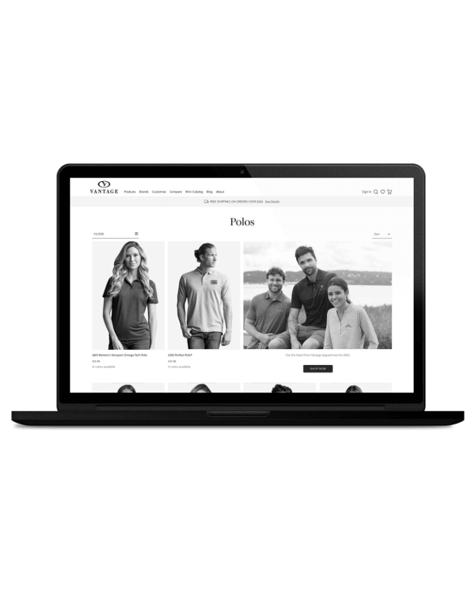
Currently, the site has very few marketing areas available on the site. I increased the amount and size of the marketing areas on the home page. There is now a skinny banner up top underneath the nav bar that will allow for simple messaging, like free shipping or discount messages. On the product catalog pages there are two new marketing areas that are mixed into the product grid to give Vantage a place to cross sell their merchandise.
The site currently has plenty of useful tools available for their customers to take advantage of, but they seem difficult to use.
The first thing I did was update the virtual tool to be way more user friendly, with easy to follow steps for creating a logo layout. Secondly, I made the favorites and the mini catalog more distinct, as I could not even differentiate the functionalities between the two. Currently I could not even differentiate the two functionality. So I made the favorites function like most other sites and allowed the mini catalog to be saved and named, then stored in the myVantage portal for later use.
I also cleaned up the compare tool and all the site tools now have a find my style tool. Currently within the tools, the user would have to know the style number to add a garment to the tool, which was cumbersome and intimidating. In the find my style tool, the user can use various search tools and actually see the garments before choosing to add them to their favorites, mini catalog or compare.