Decoration Materials is a B2C tile wholesaler that caters to high end interior decorators and clients. They wanted to update the look of the site, fix a few minor UX problems, and make the site look more in line with their customers’ expectations. I was provided with persona and SEO research.
Take the current site, conduct design and competitor research and come up with a design that caters to their high end clientele. Provide a high fidelity prototype with a totally refreshed look and would include desktop, tablet and phone layouts. Once I handed off the site to dev, I would then QA for front end fixes.
update look and feel
create a better user experience
iterate prototypes based on feedback
create a working prototype for dev
In order to update the look and feel of the site, I researched what their competitors were doing.
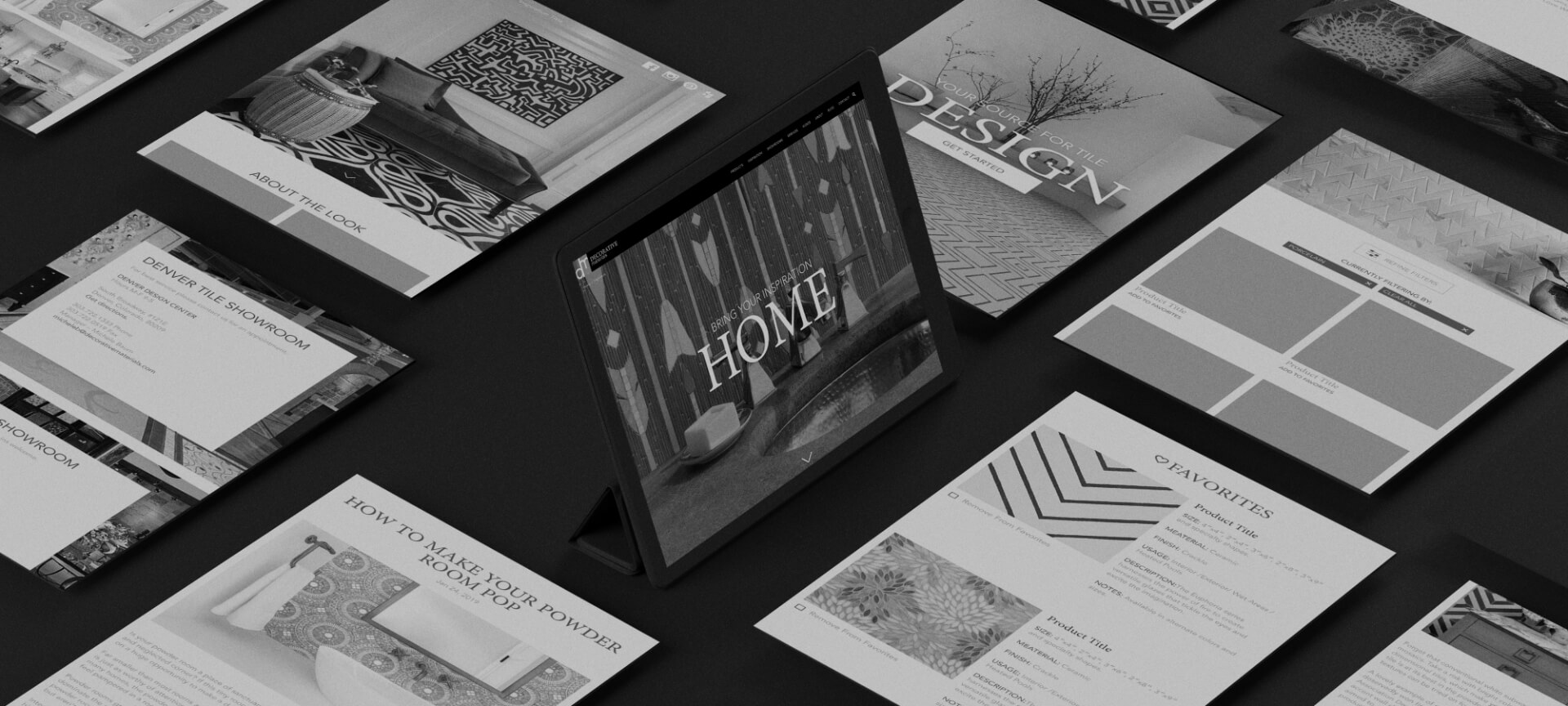
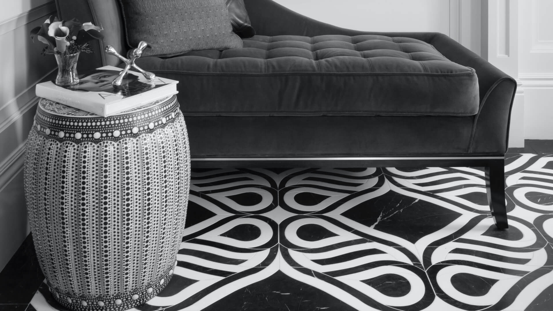
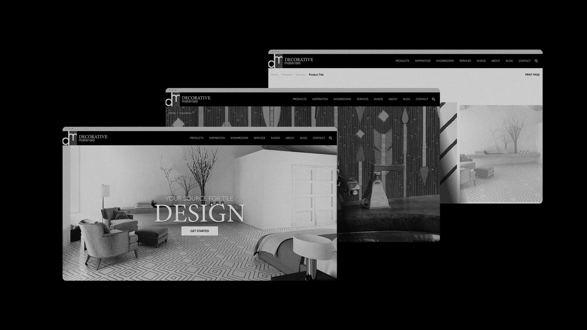
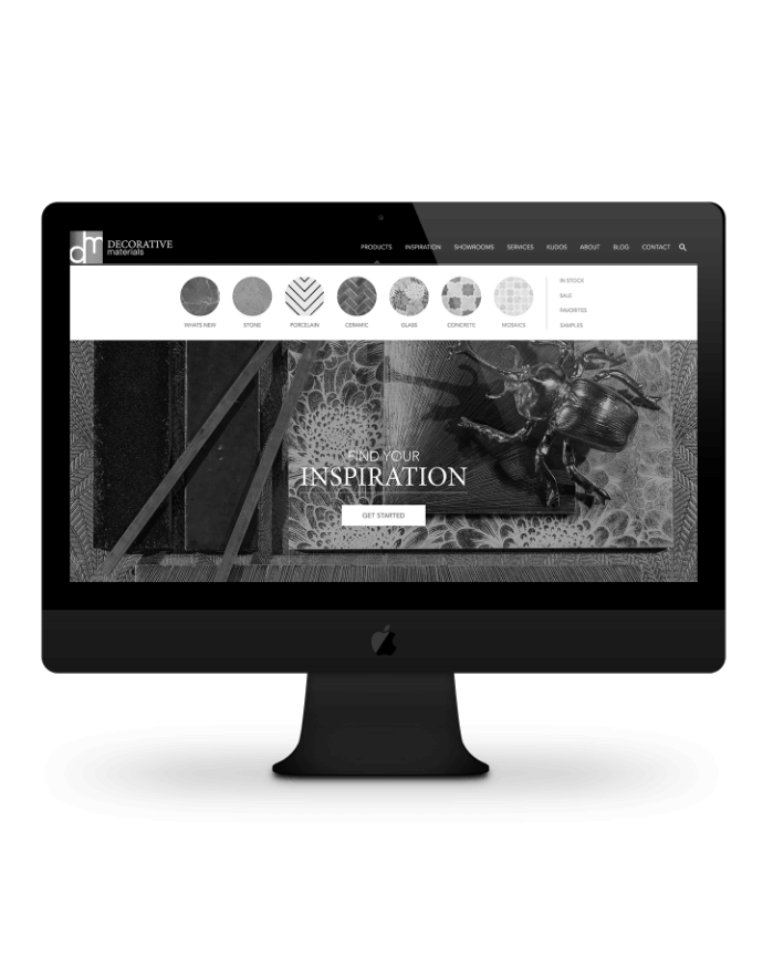
The first thing to do for Decorative Materials was to bring the site up to full width. The next step was to use larger lifestyle images throughout the site, especially on the homepage and about pages. This would allow the customer to get a feel for how the tiles could elevate their living and work spaces.
We needed to increase the size of the product and inspiration photos as well. It’s important for the clientele to see how beautiful the tiles are at a quick glance.
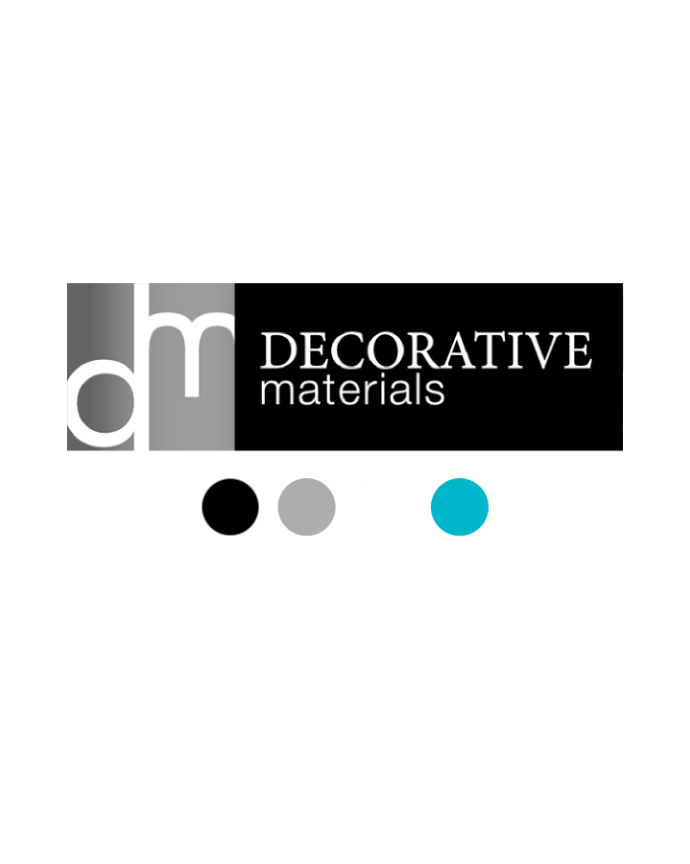
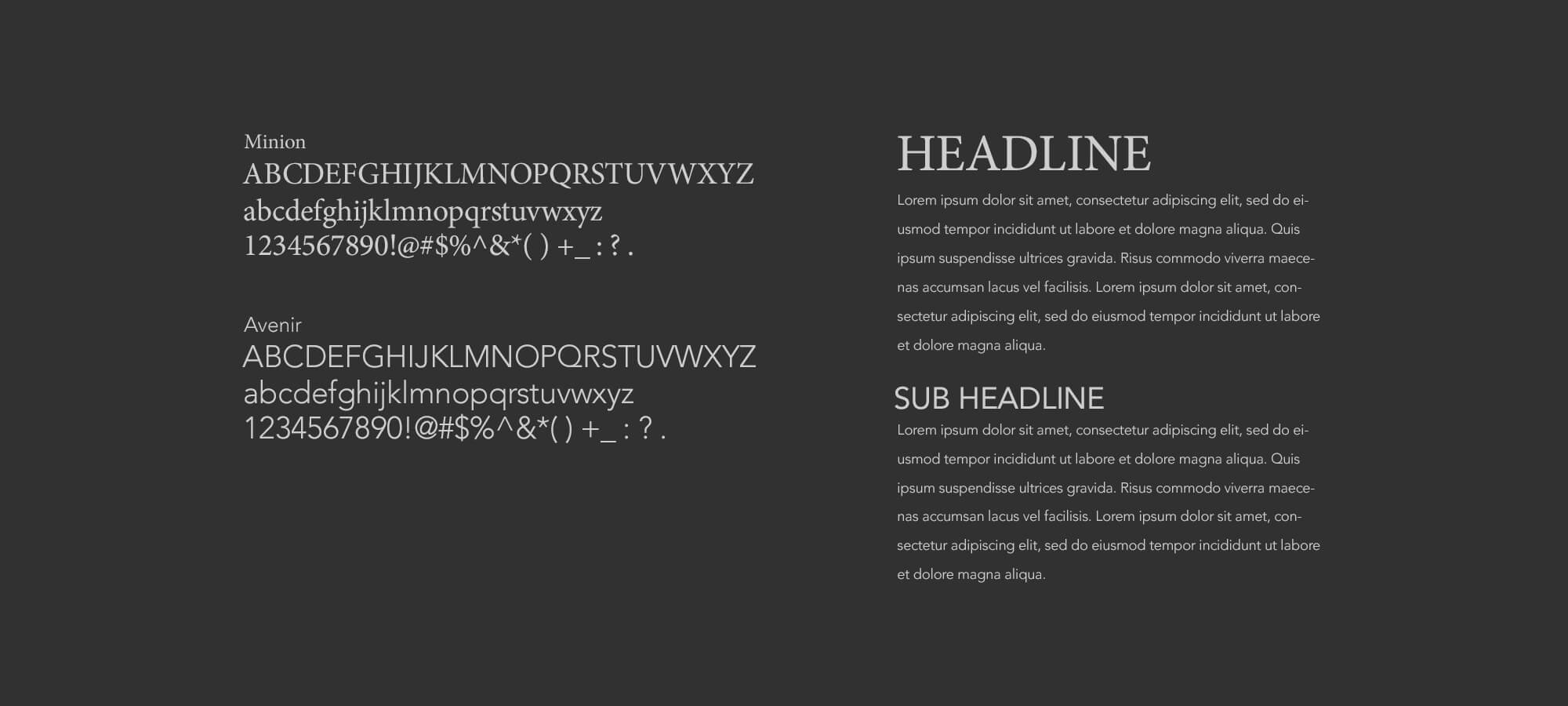
The fonts I used were Minion Pro for larger headlines and Avenir as body copy. I wanted the color scheme to be light and sophisticated, so I used the cyan from their logo as the main color pop throughout the site, and a mix of light grey and white elsewhere. I kept the nav bar black for contrast.
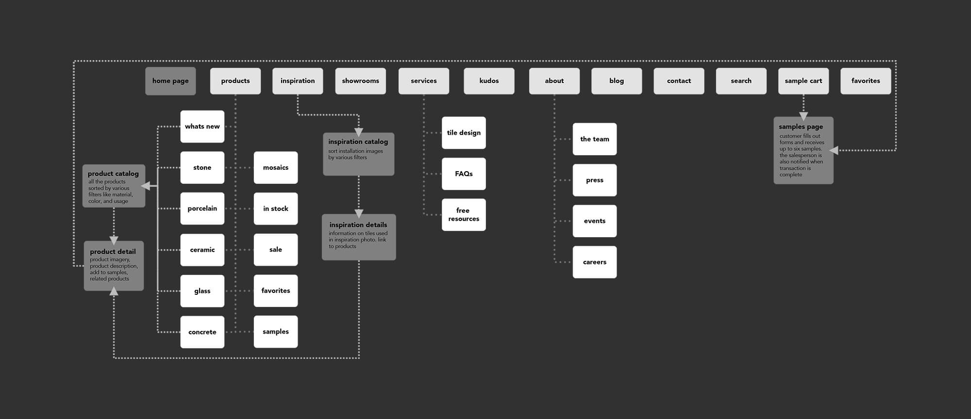
The nav needed to be updated, condensed, and reorganized. I used a slider nav for the Materials drop down to give a little preview of the materials.
The site doesn’t allow for purchasing, instead customers are supposed to contact salespeople or order samples. The system they had originally was complicated and required the customer to save their favorites and email the salesperson. So we just used a simple large CTA at the bottom of the product page and added a cart-like system for samples to check out. When the user submits the Sample Form Request, an email alert will be sent to the salesperson.
Decorative Materials provided several rounds of user/employee feedback on the initial prototypes and I was able to update the prototypes with a quick turnaround. The initial concerns were about type sizes. I provided the client with an html/css document that would display the type true to form and this seemed to clear up any confusion about font and type treatment.
The main sticking point was the integration of the current Hub-Spot forms into the site. An outside team was hosting and updating the forms and it became difficult for them to maintain and update to the current styling. Unfortunately, some of the initial UX decisions had to be dropped to accommodate for this budgetary and logistical concern.