
Choose Colorado is a government site dedicated to showing off the benefits of the state and to attract business, industry and residents alike. Choose Colorado came to us to discover a new design for the site. I was provided with SEO research and user analysis data from Choose Colorado.
My role was to review all the research the SEO team and the team at Choose Colorado had done on what attracts people to the state. After reviewing their research and conducting design and competitor research it was my job to come up with a high quality grey box wireframe prototype for a new site.
study the research and competitor state sites
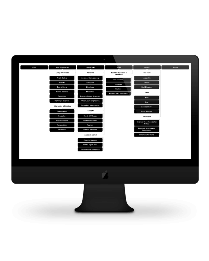
create a site map of the site
use the research to drastically reduce the site down to the core elements
iterate the wireframe based on user feedback
figure out UX solutions that would work for Choose Colorado and their users
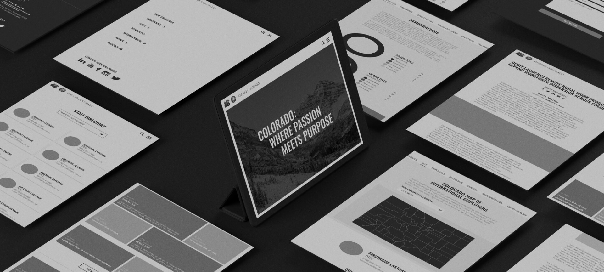
create a gray box prototype for client review
Choose Colorado, being a government site, had a lot of research to review. I went through all the SEO research and figured out what the most popular and viewed pages were and made sure to highlight those in the design.
Choose Colorado did extensive research on what potential residents and industries were looking for in a state they were looking to relocate to. This information was invaluable to give the site the correct hierarchy. Finally, I researched several competitor state-run sites including Virginia and Tennessee, to see how they were not only laying out their information, but what information was important to them.
Choose Colorado’s current site had approximately 1,500 pages. Most of these were blog or informational pages. The client wanted to drastically reduce the size of the site making it easier for future industry or residential customers to access all the information.
The key stakeholder at Choose Colorado also wanted to split up the information into two categories, those already in state that were looking to improve their lives and those looking to relocate to Colorado. Currently, this information was jumbled up on the site and hard to parse. After researching and site mapping both a single site and a two site solution, it was decided two more focused sites would be a better UX decision. Choose Colorado would be the site used to incentivize potential industry customers.
The biggest concern coming from the client was the length of the site pages. They were concerned nobody was going to scroll down far enough and that people would give up and leave the site before they found the info they were looking for.
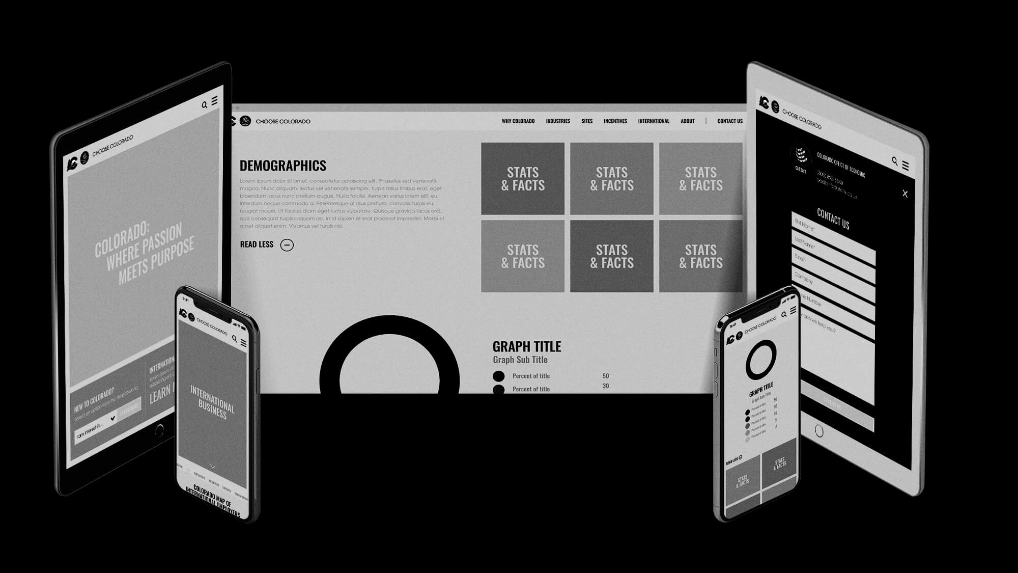
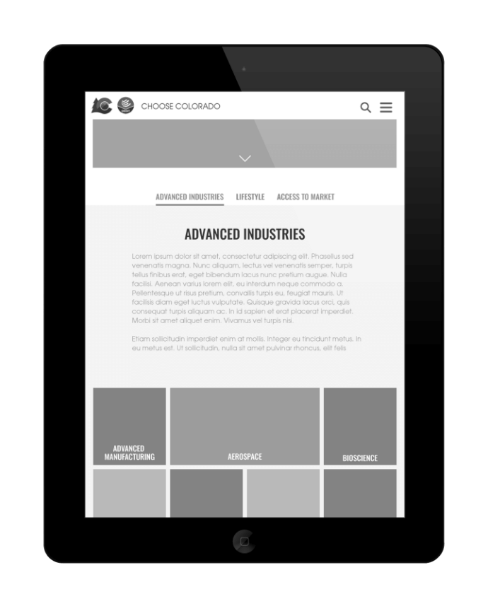
I needed to come up with a solution that would still allow for all the information to be there but would be easily scannable and reduce the extra scrolling. So I came up with a modern tabbed data solution, where the user could quickly see what was offered in that section with an overview. If the user is interested they can navigate left and right to further review the data.
Another big UX change was the addition of the Quick Start links on the homepage, so users could quickly jump to the sections they were looking for without having to navigate the site.
Choose Colorado reviewed and tested the initial wireframes and provided feedback. It was during this process that we had to course correct and move to a two site solution.
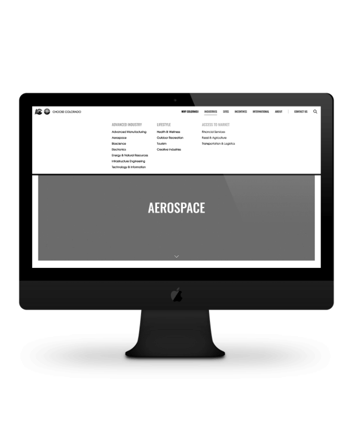
There were many UX changes needed through out the site, the first problem being the nav. The current site’s nav was split into multiple sections, some of which didn’t seem to work or have a clear hierarchy. I reduced this down to a single clean line of navigation with easy and consistent dropdown menus.
The current site was massive and difficult to navigate. Simplifying was totally necessary to accomplish the goals of improving the usability of the site. Using the research, we were able to reduce the number of pages drastically. Also splitting the site into two helped clarify the amount of pages.