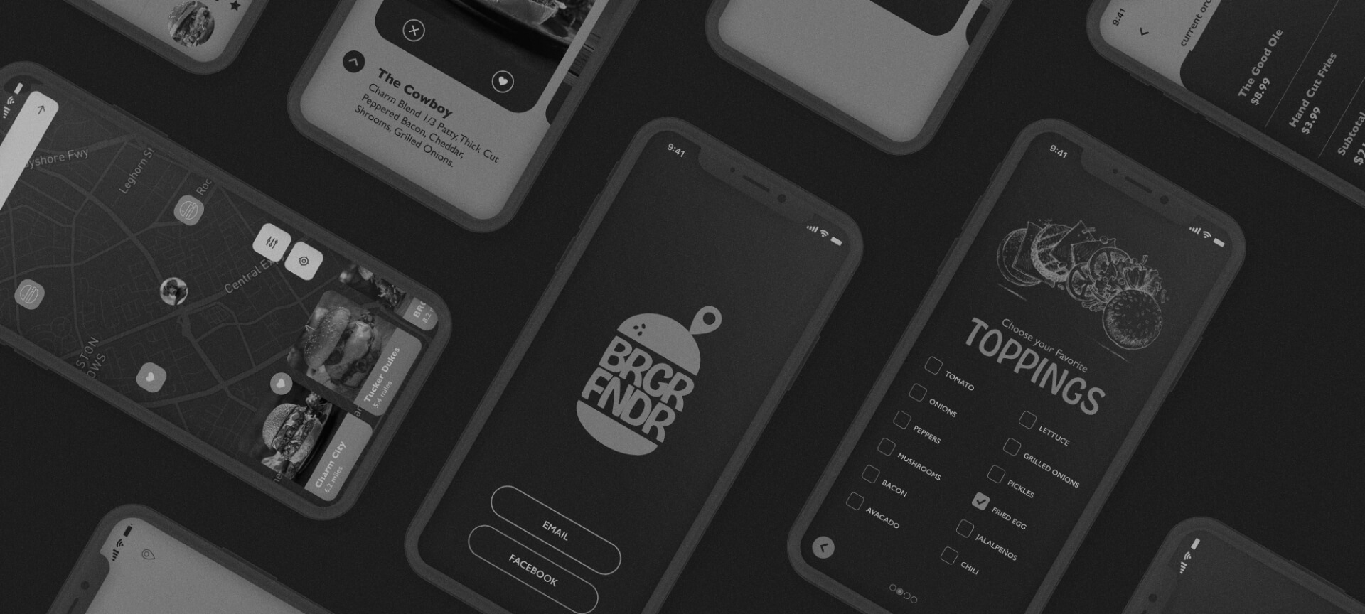
BRGR FNDR is an app idea for users to discover and rate different hamburgers in their town based on their flavor profiles. They would be able to scroll through images of the burgers, and if they liked one, order it for pickup or delivery. It’s Tinder for burgers.
This is my personal project, so I am involved in everything–from the brand’s look and feel, to how the app would work, and what features to include. This was a very fun experience for me.
come up with an idea for an app
create a cool brand identity
create a features list
test the app
design the prototype
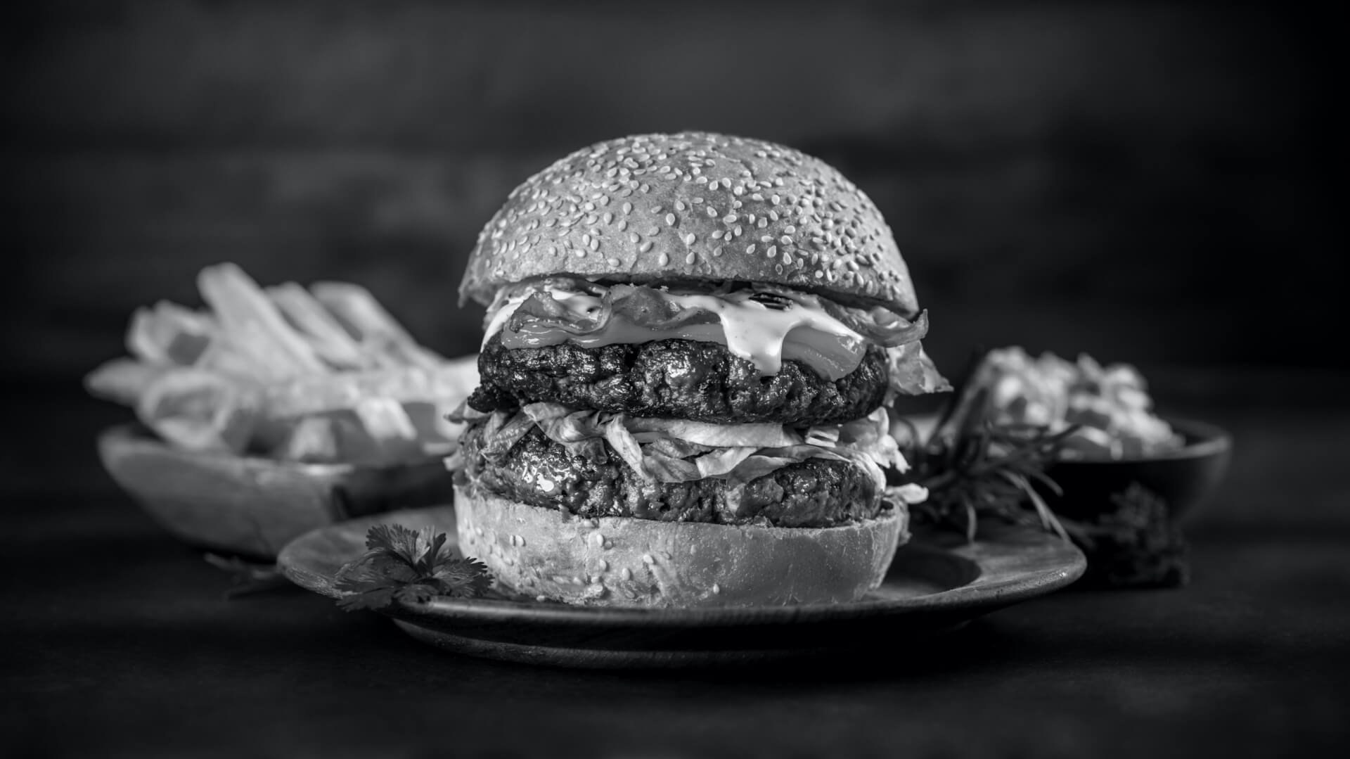
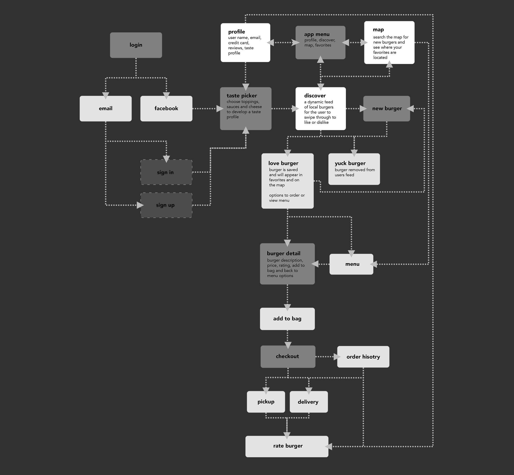
The most crucial step of any app is to come up with a good idea that people would want to use. Of course everybody needs to eat and well, I really enjoy a good hamburger. My thought was to create Tinder for hamburgers, letting users quickly rate and choose which burgers they would like to eat. And when they like or match up with a burger, they could easily order it. The users could also use a maps to discover burgers near them and see where all their favorite burgers hang out.
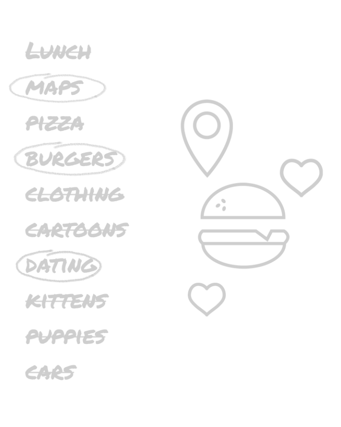
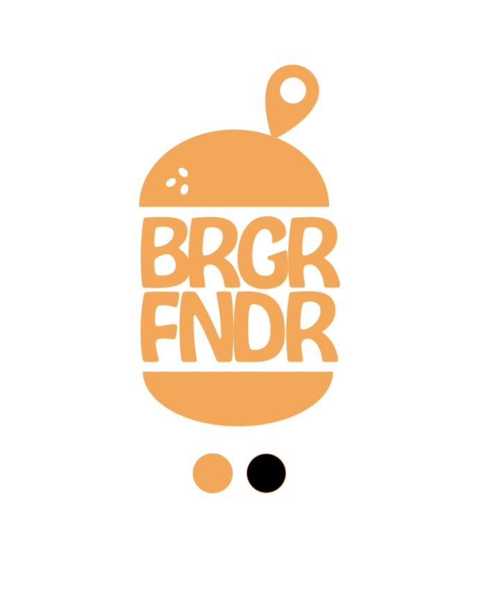
The brand logo is obviously based on a burger and bun, with a little map pin thrown in. I think people would instantly get what the app was about just from the name and the logo.
For colors, I chose a tan and black. The tan evokes butcher’s paper or the carry out bags restaurants often use to serve their tasty burgers to go. The black just works to offset the tan and give the design balance.
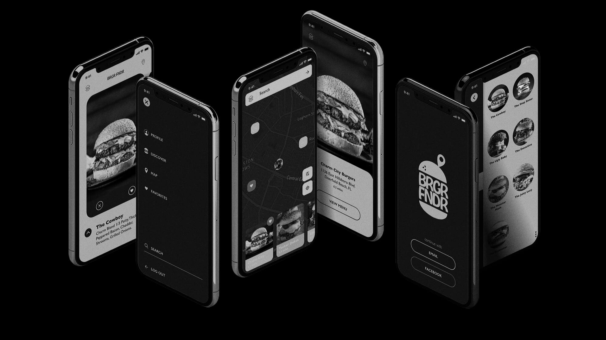
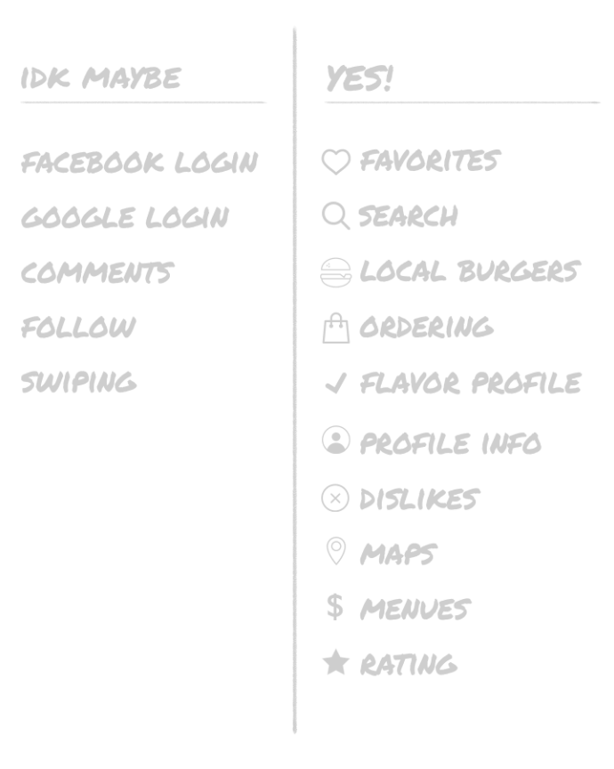
For features, I wanted to keep the app simple and concise. It should just help the users find their perfect burger. I wanted to include the ingredient selections upfront, so the app could load local burgers that would fit the user’s flavor profile.
The meat of the app would be the burger selection area, where users could Love or Yuck the burgers they see. This would teach the app which burgers that user likes and present better burgers in the future.
If they love a burger, the app would remember and of course they could then order that burger right from the app.
There would also be a map feature that would display all the burgers they have loved in the area.
When it came time to test the wireframes, I was only able to reach out to friends and co-workers. People seemed to really like the idea and the look of the app. The area that was of a little concern was how the burgers were actually rated (hint: it wasn't designed yet) and people seem to miss where the maps feature is located.
I asked questions like: What do you like most about the app? What do you like the least about the app? Do you like the interface? Was anything confusing about the app? What would you use the app for the most? Was it easy to find find the maps? Was it easy to get to the checkout? Could you find your favorites? Would you refer this app to a friend? I still need to conduct more usability tests on the app.